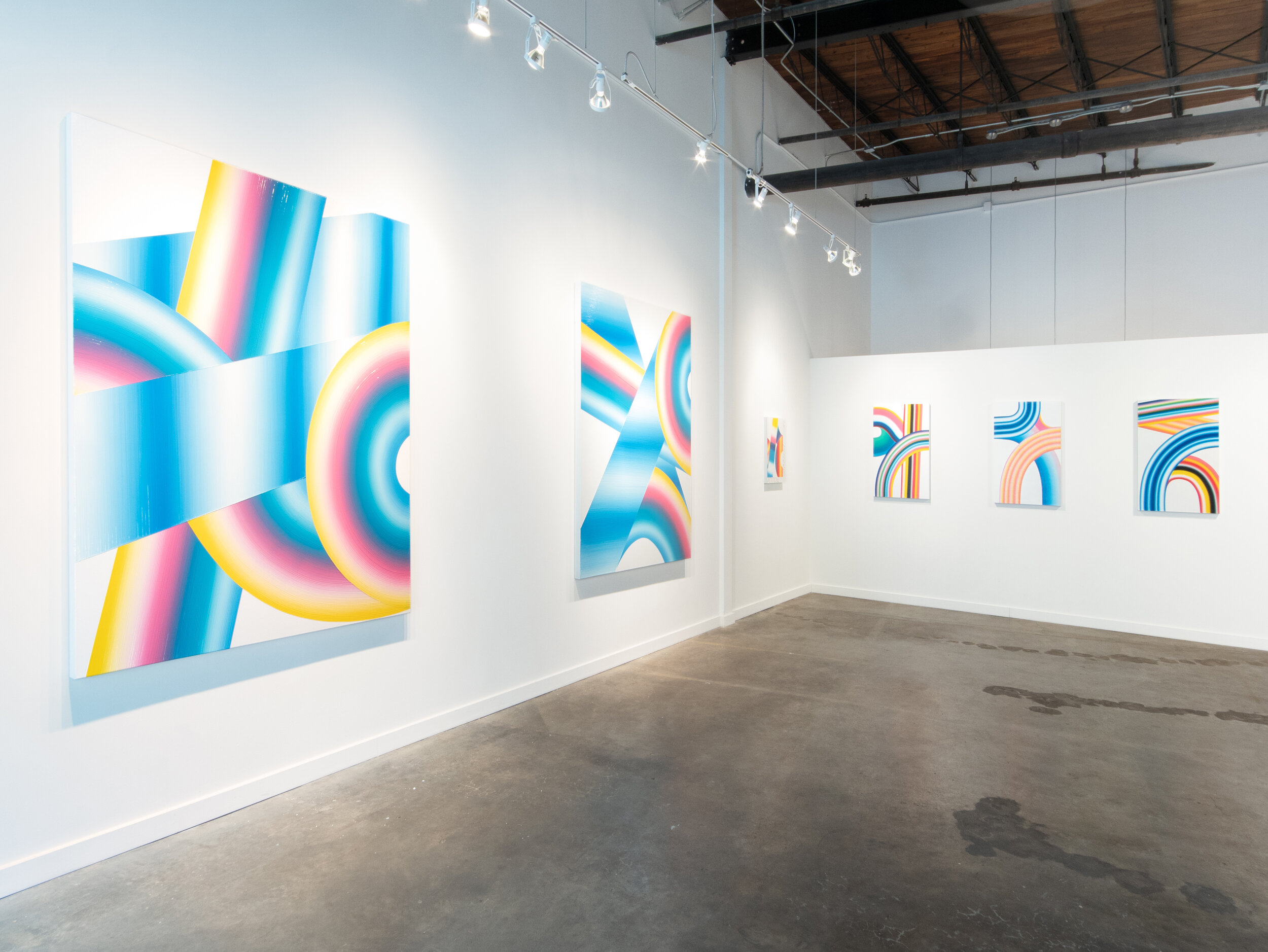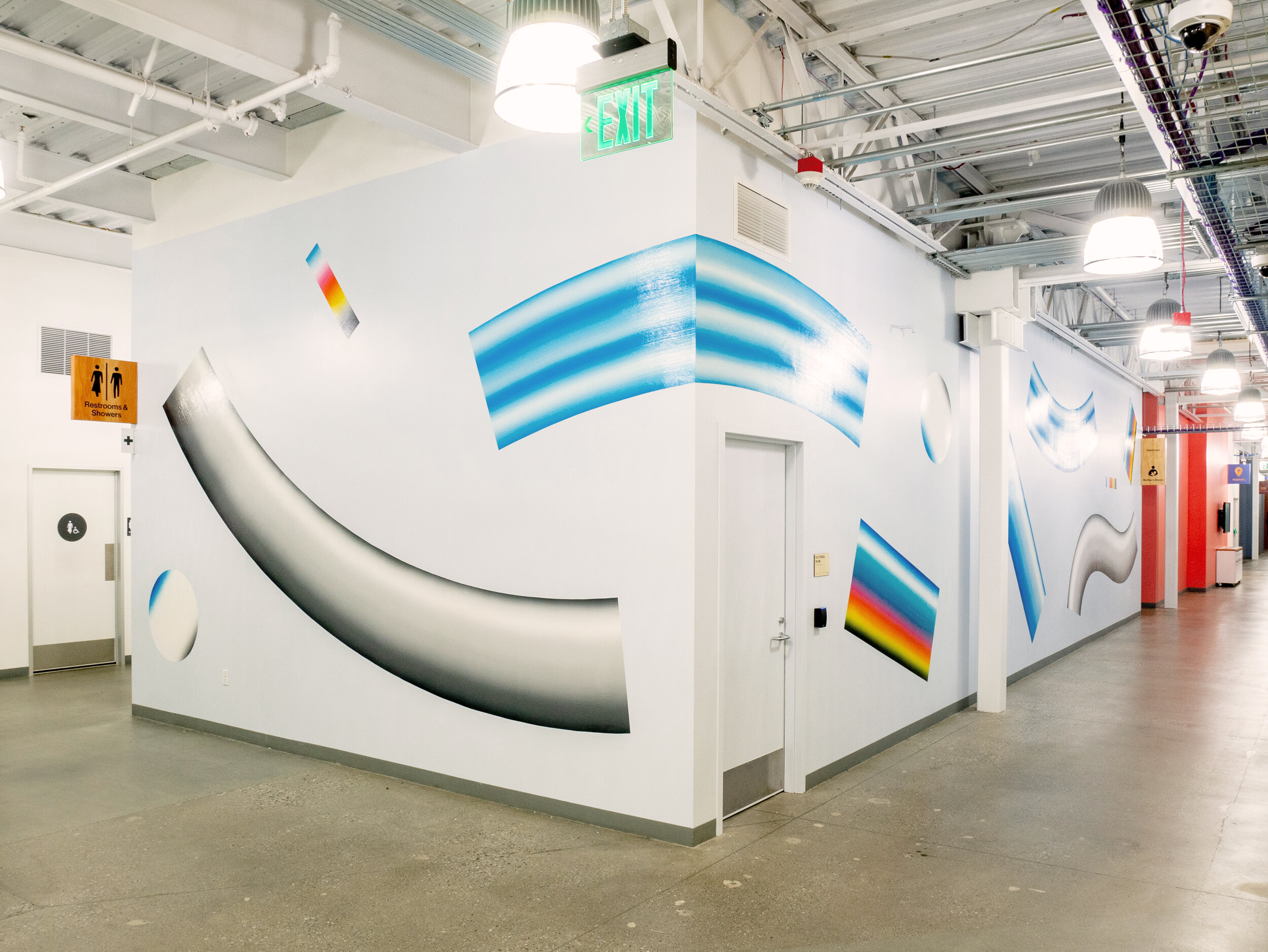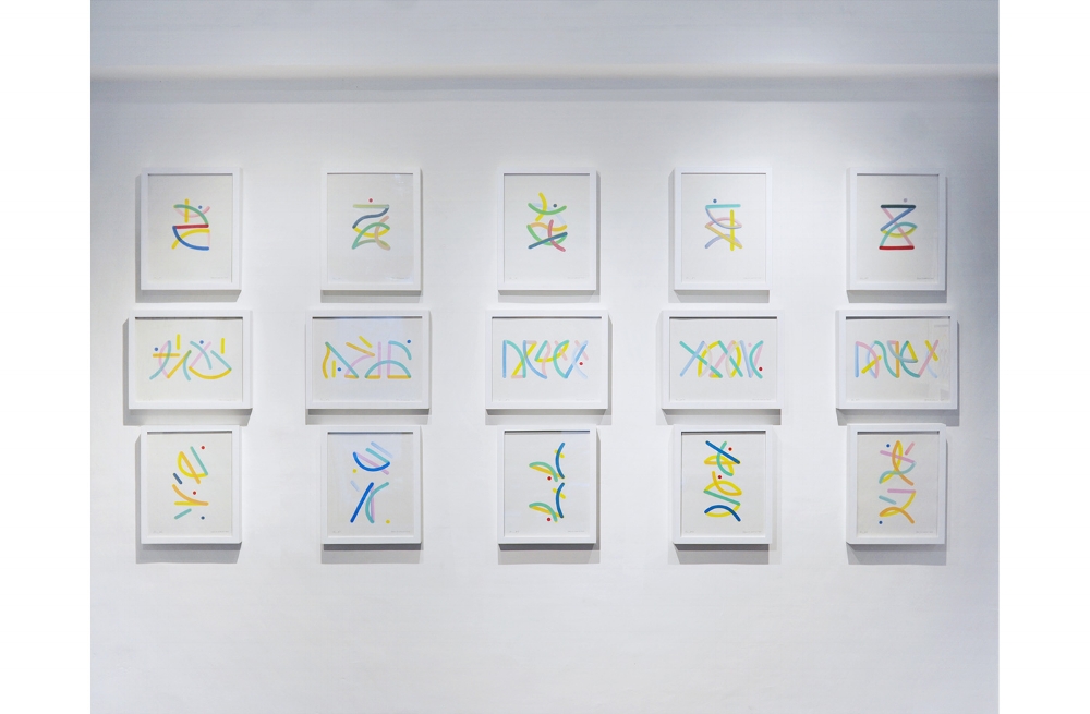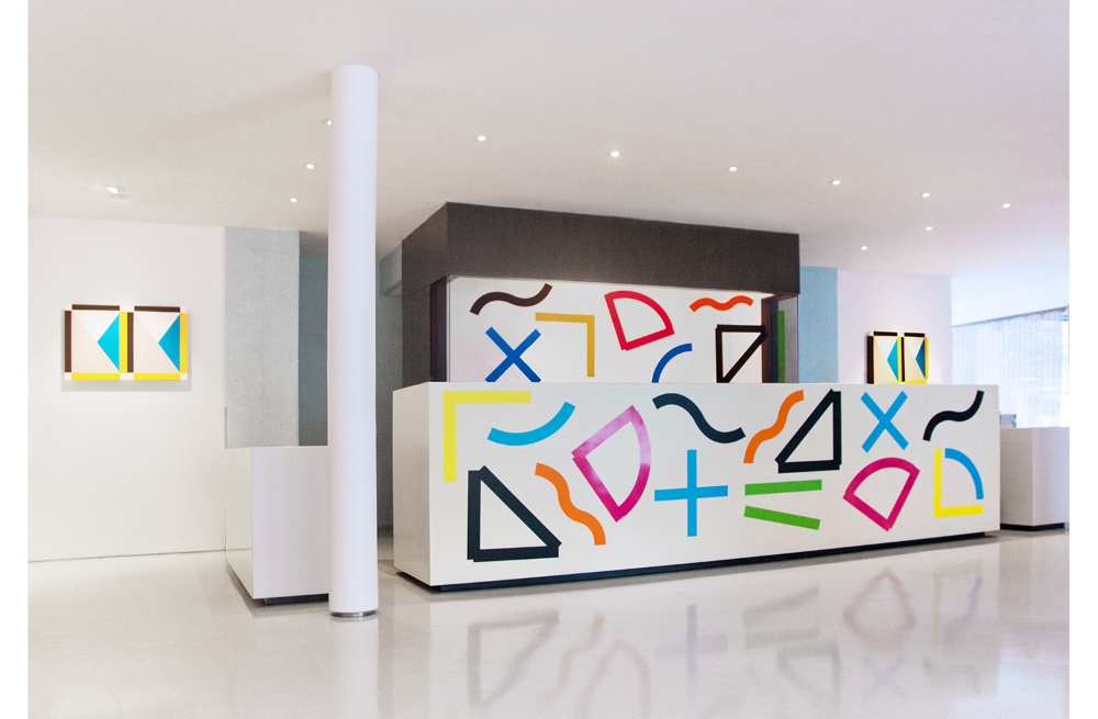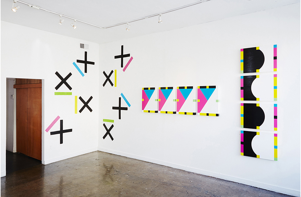
5 Shapes in 6 Colors - HVW8 Gallery - Los Angeles, CA - 2014
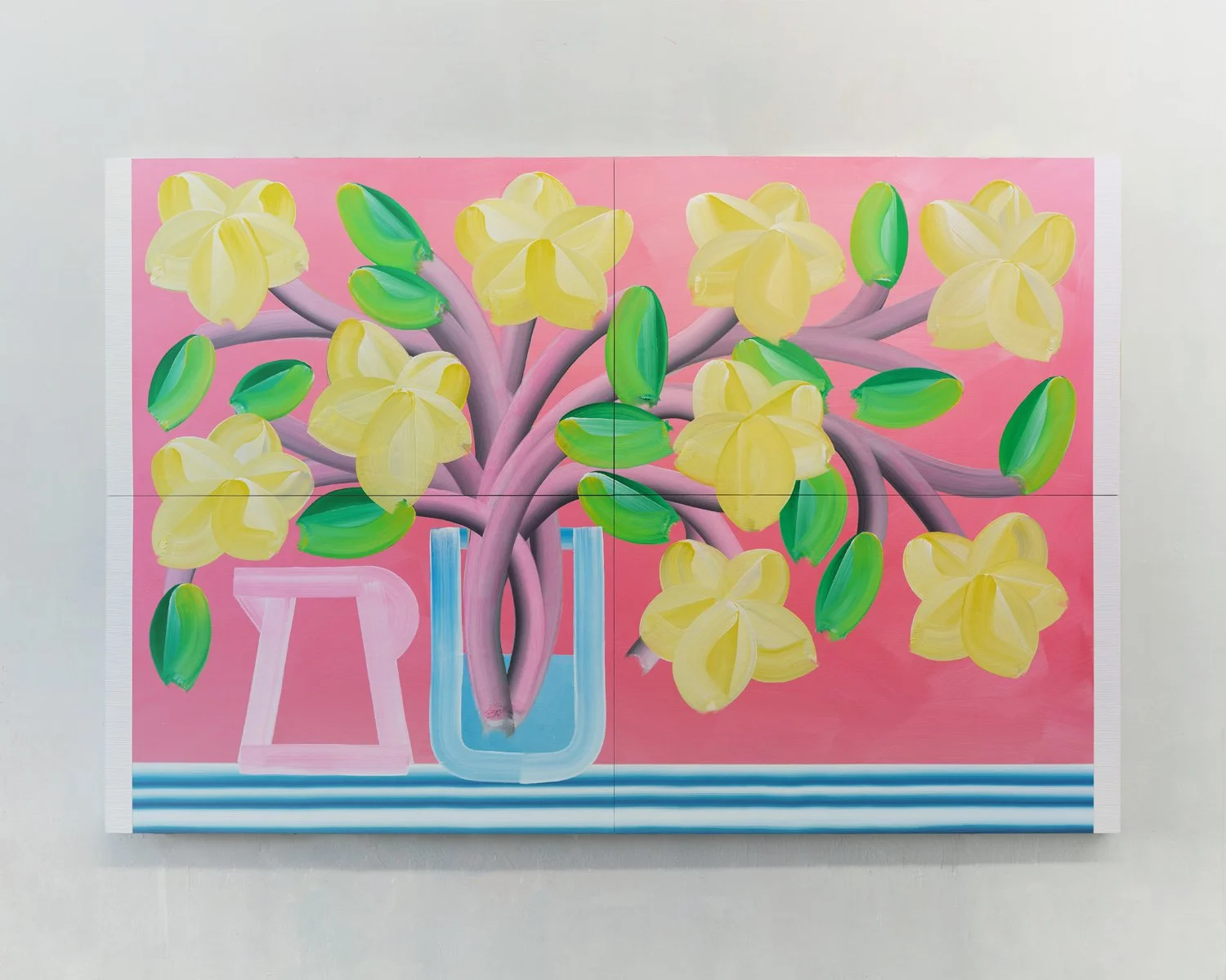
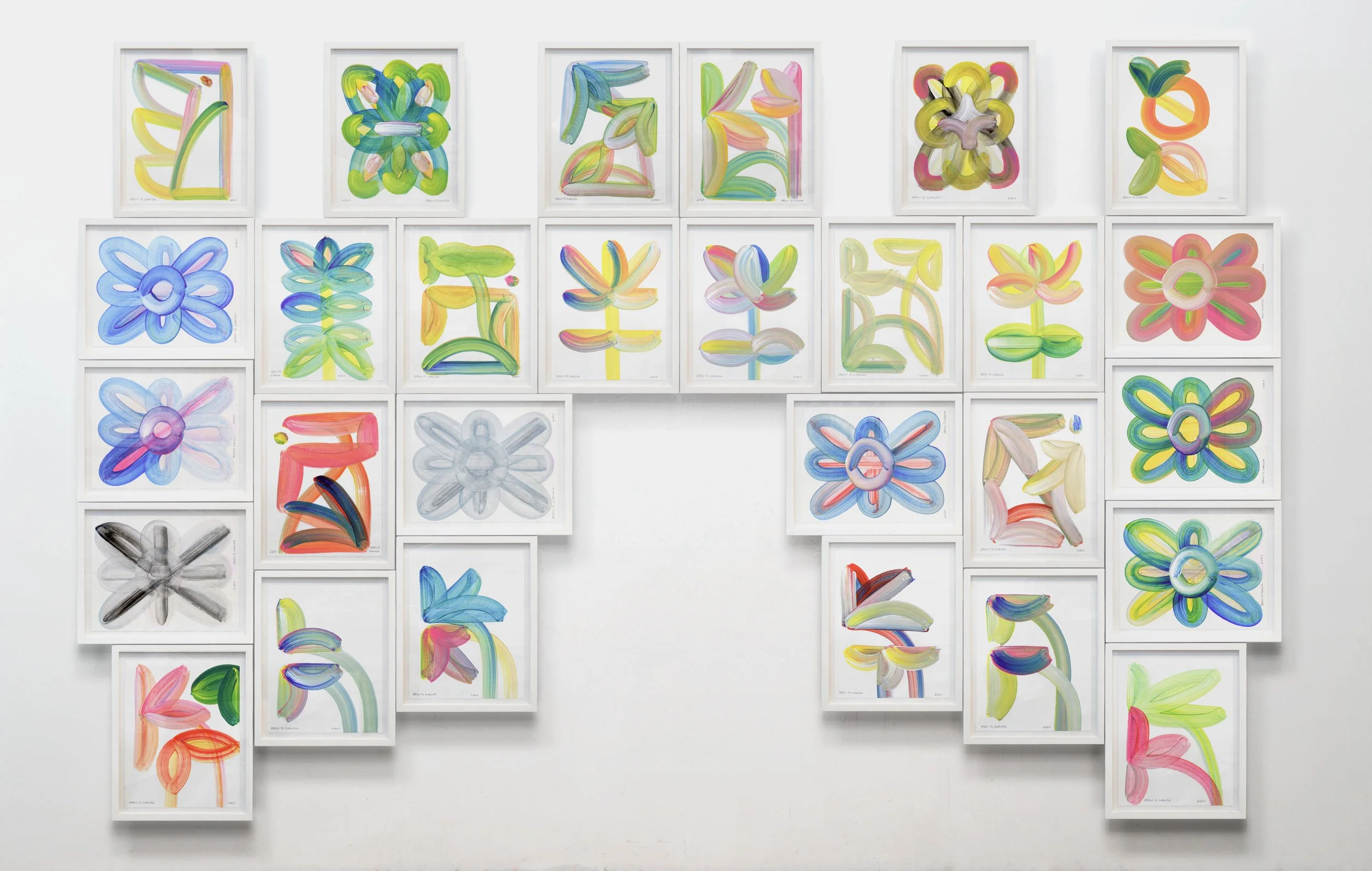
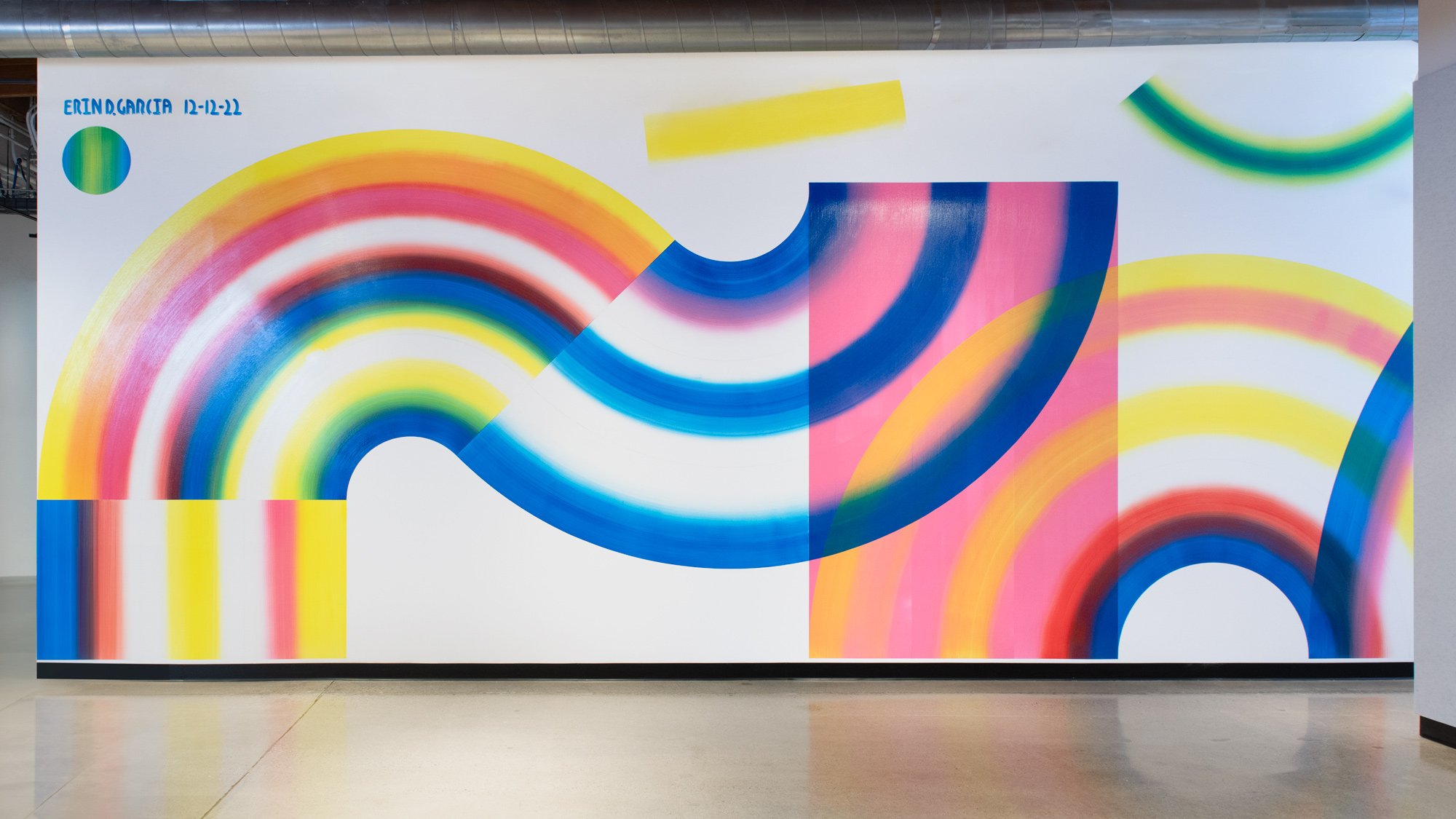
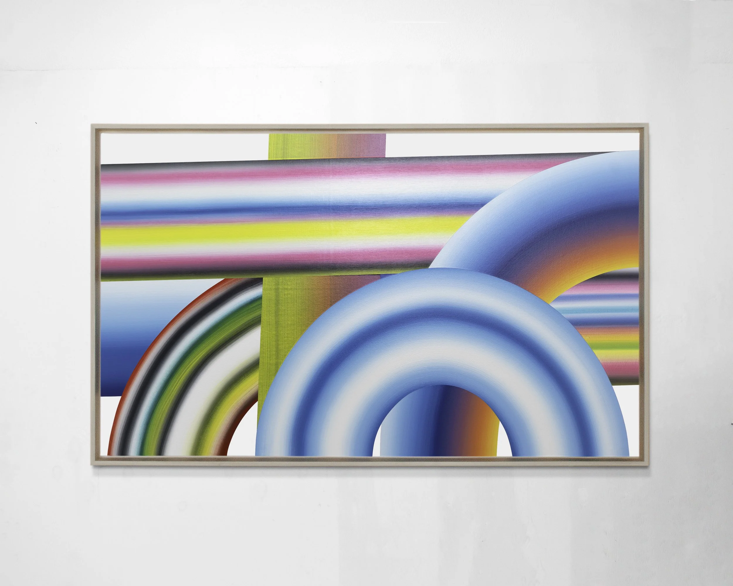
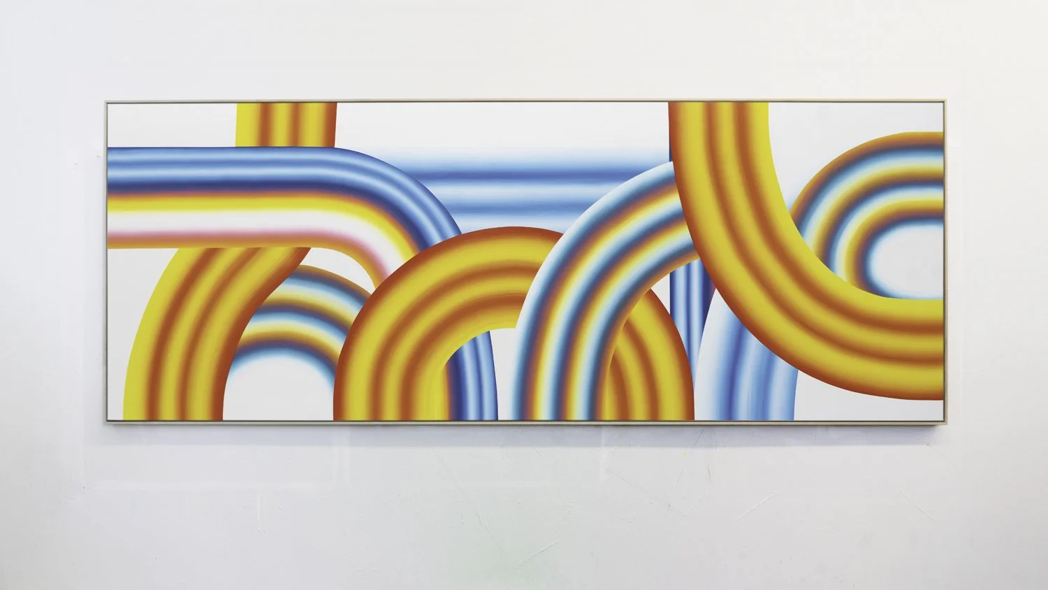
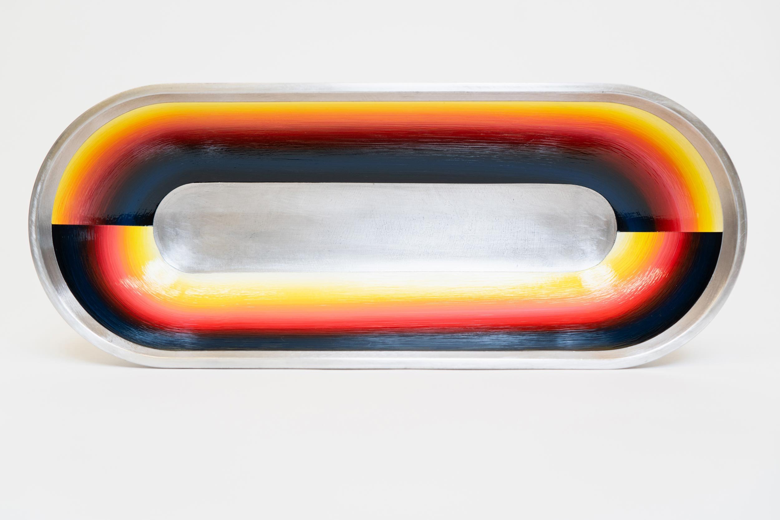
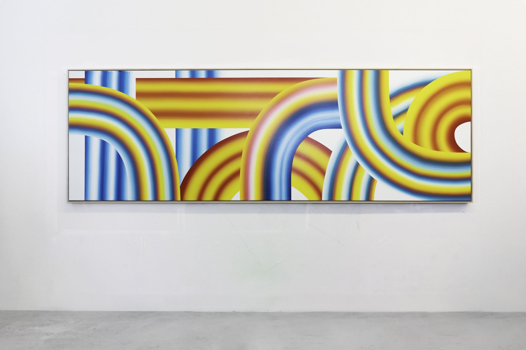
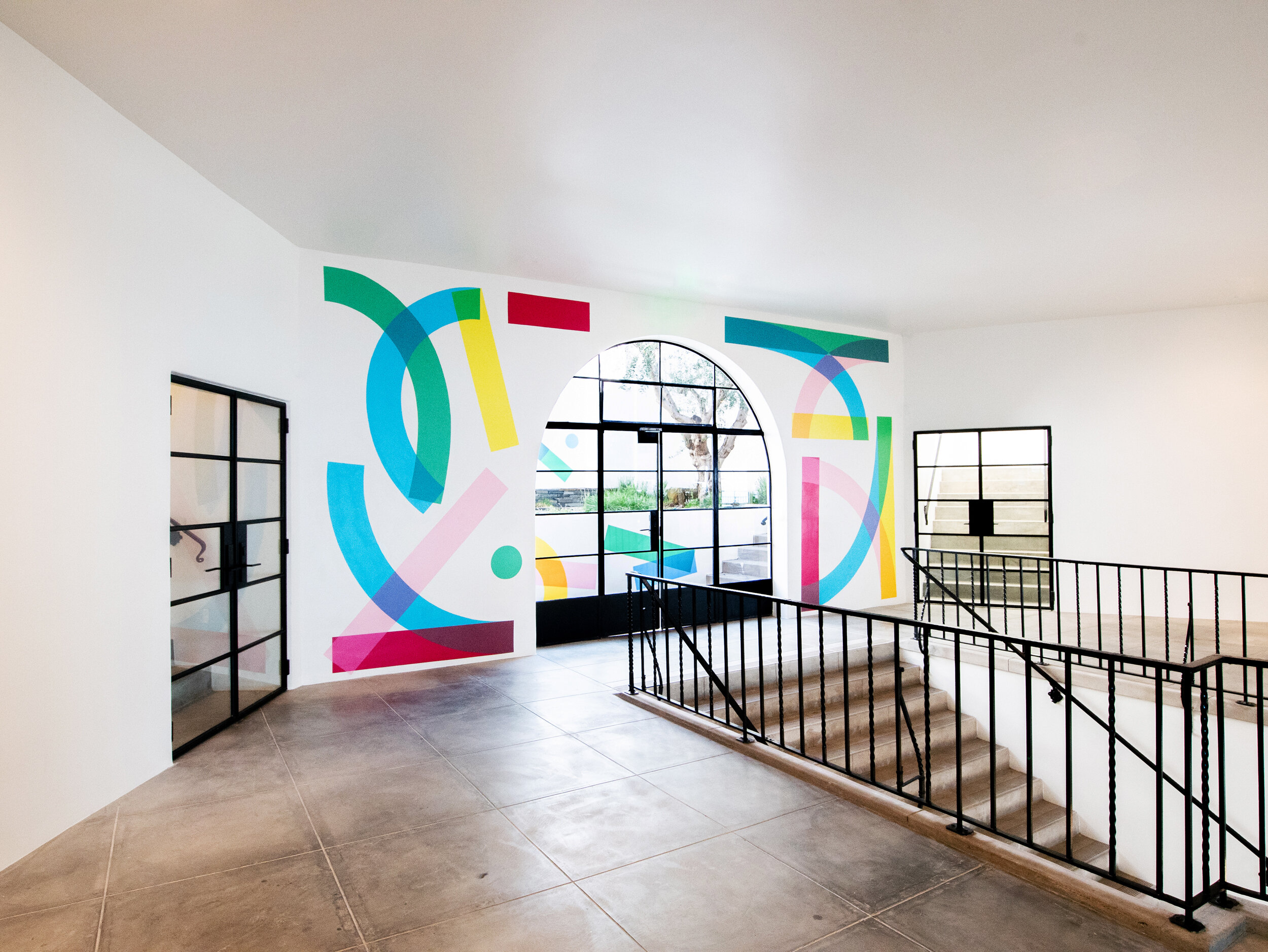
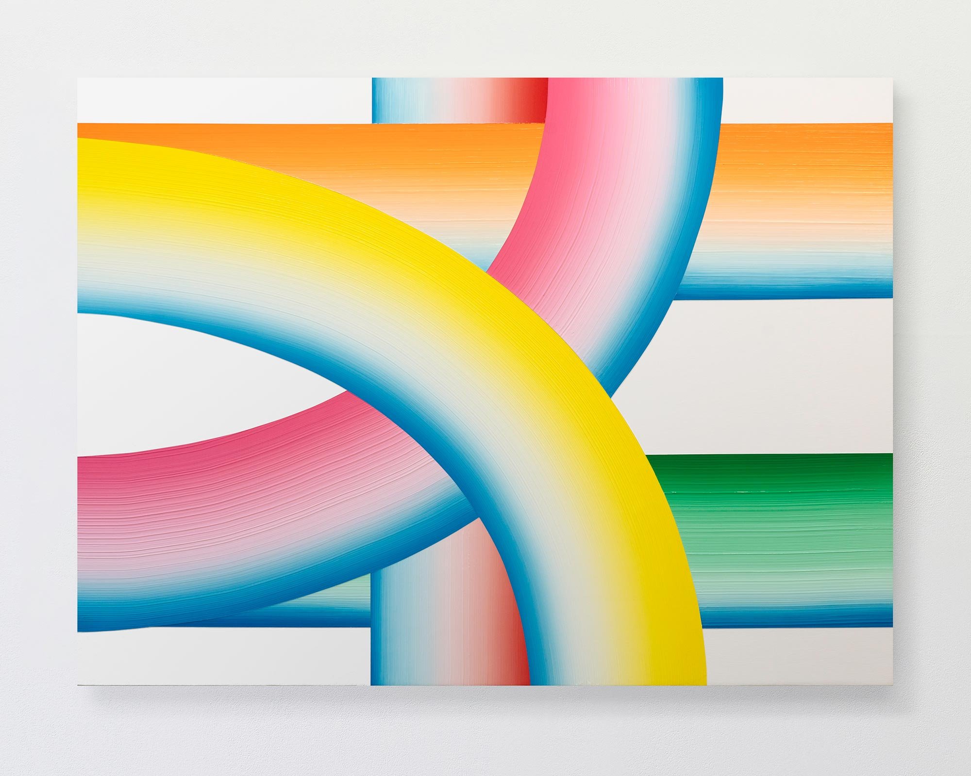
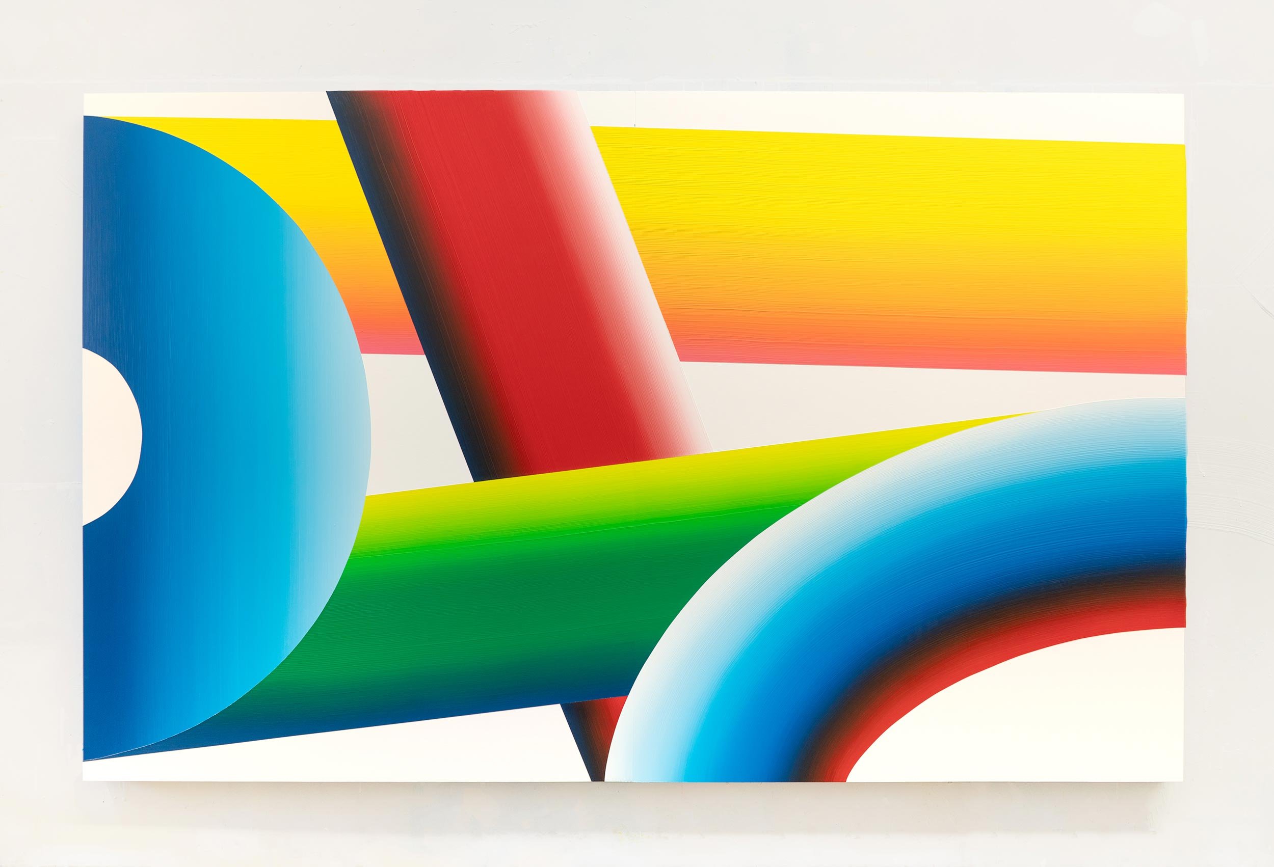
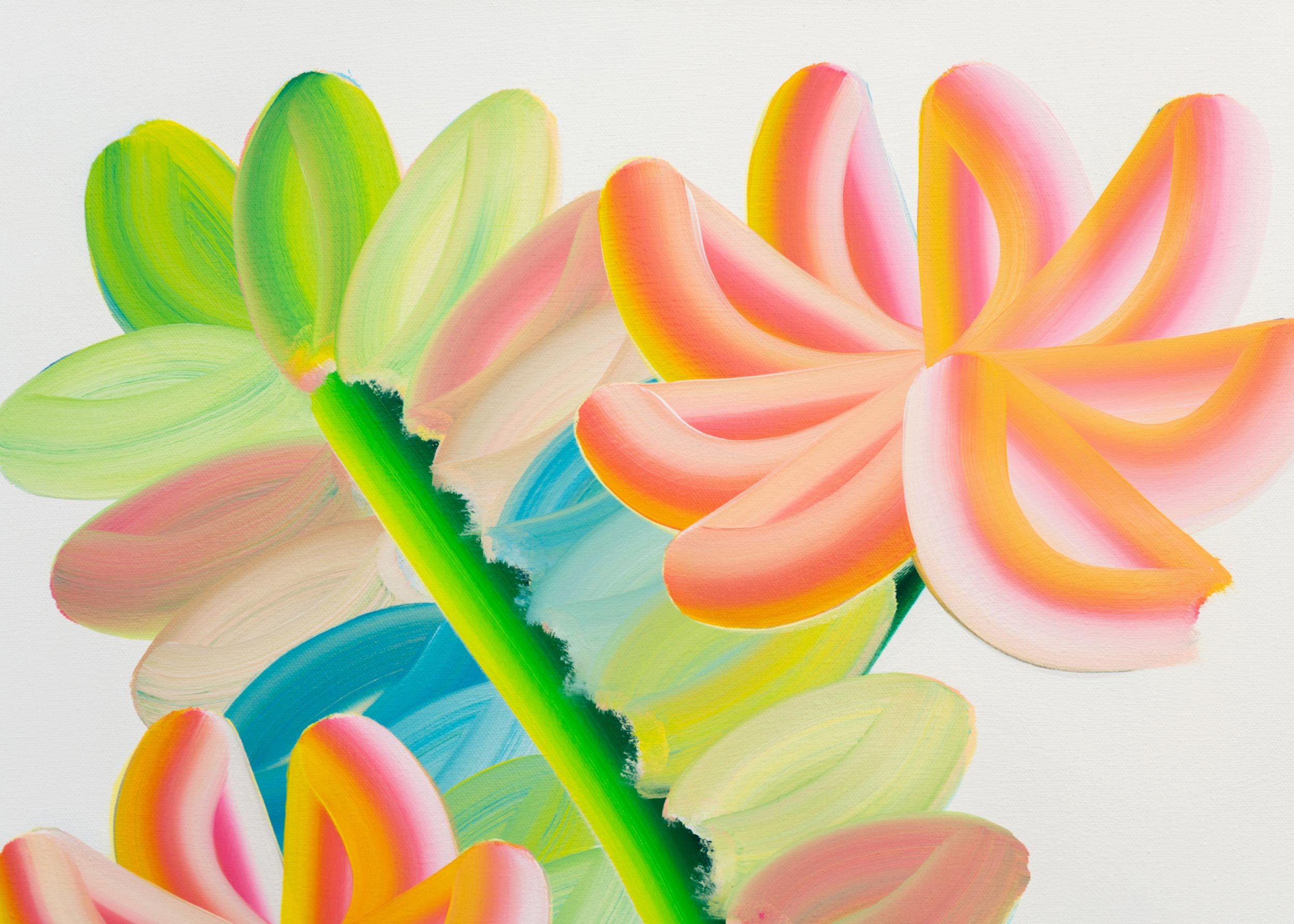
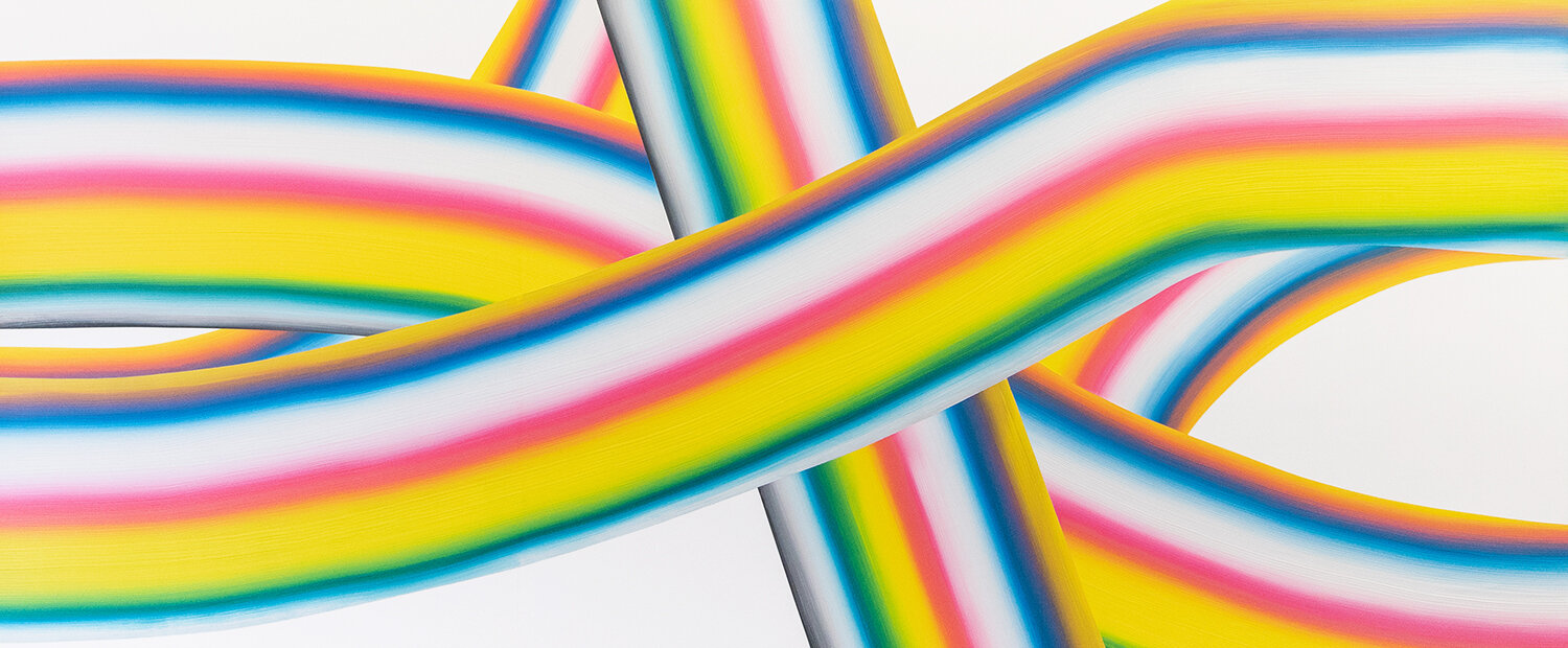
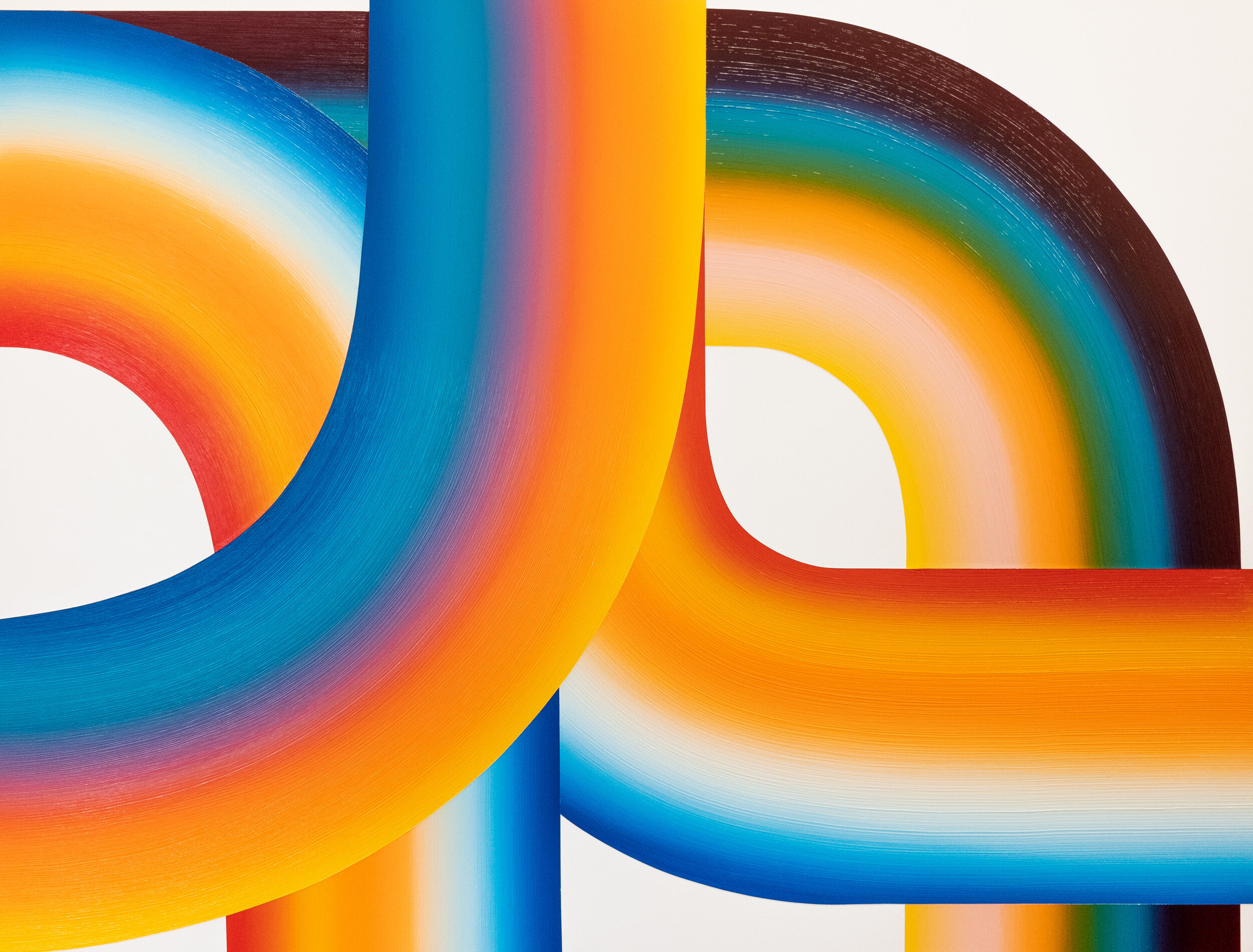
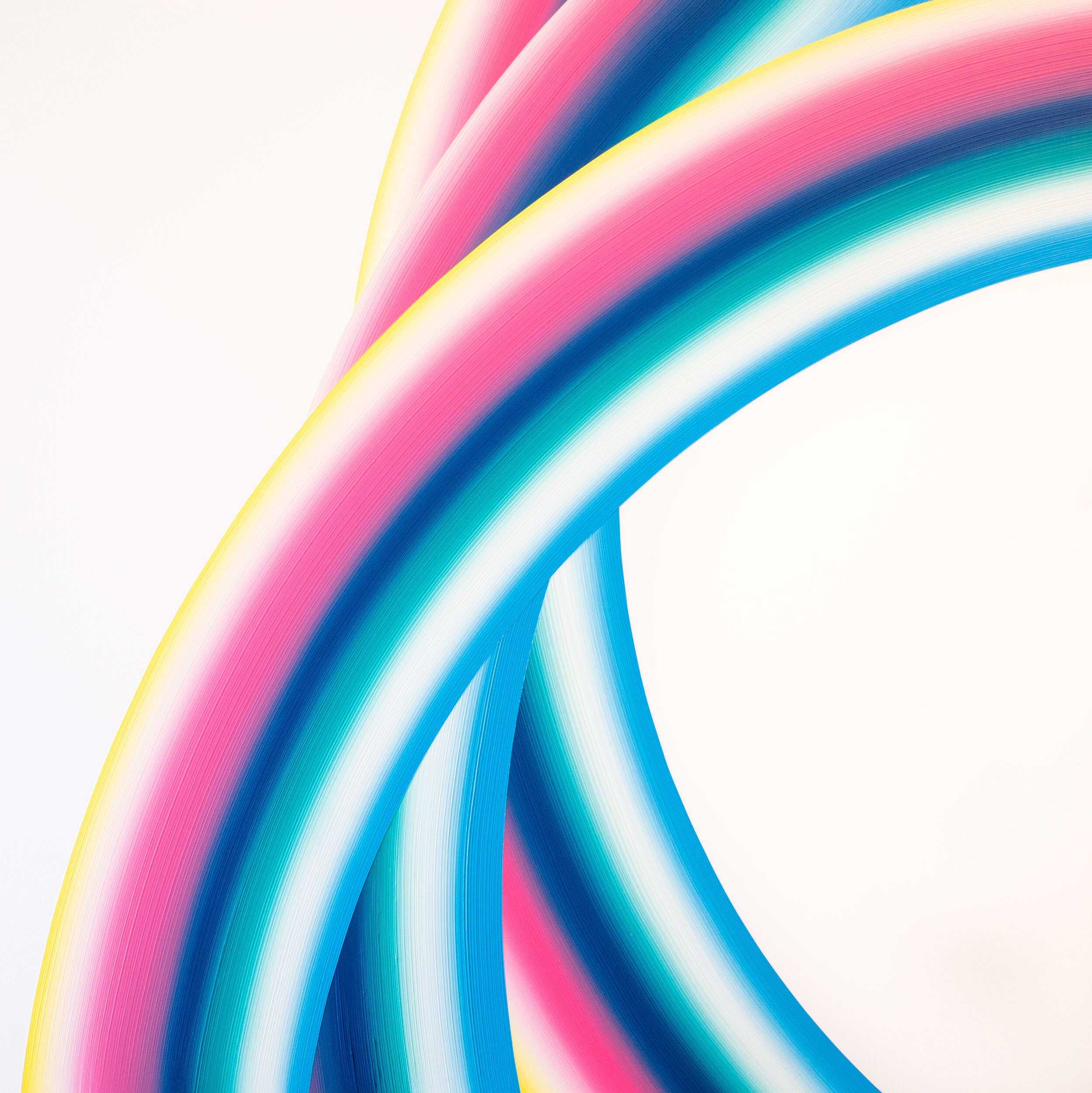
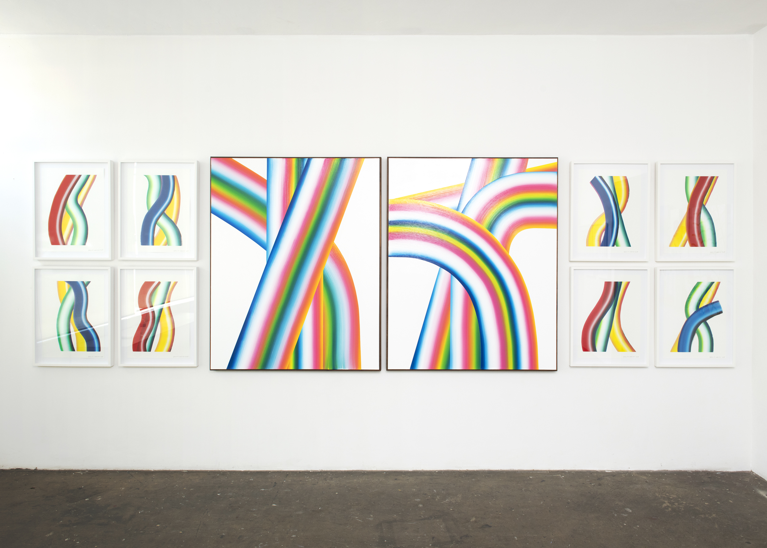
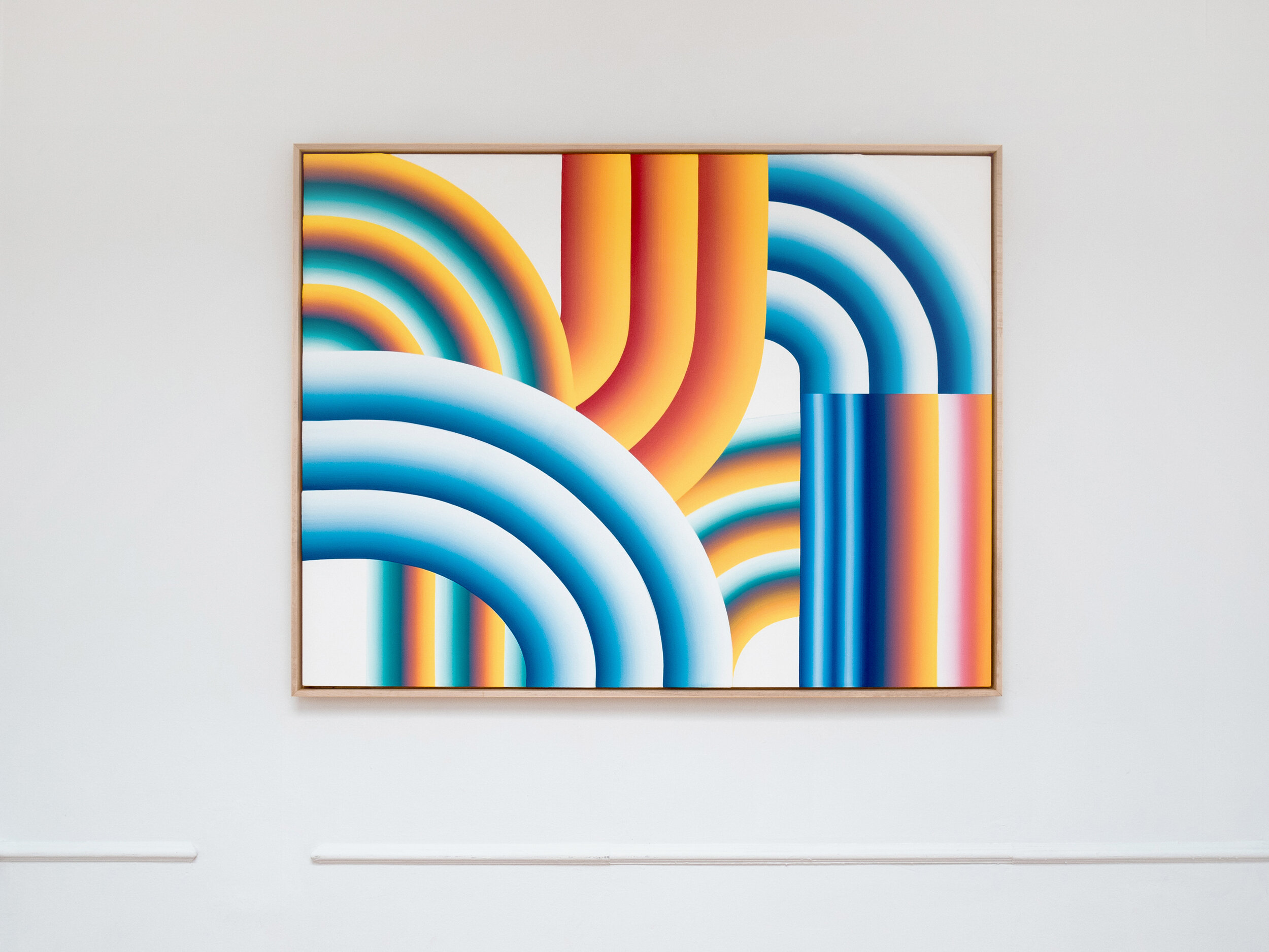
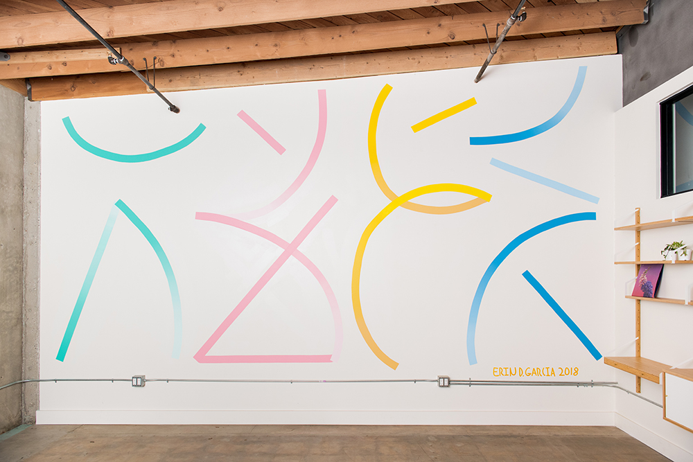
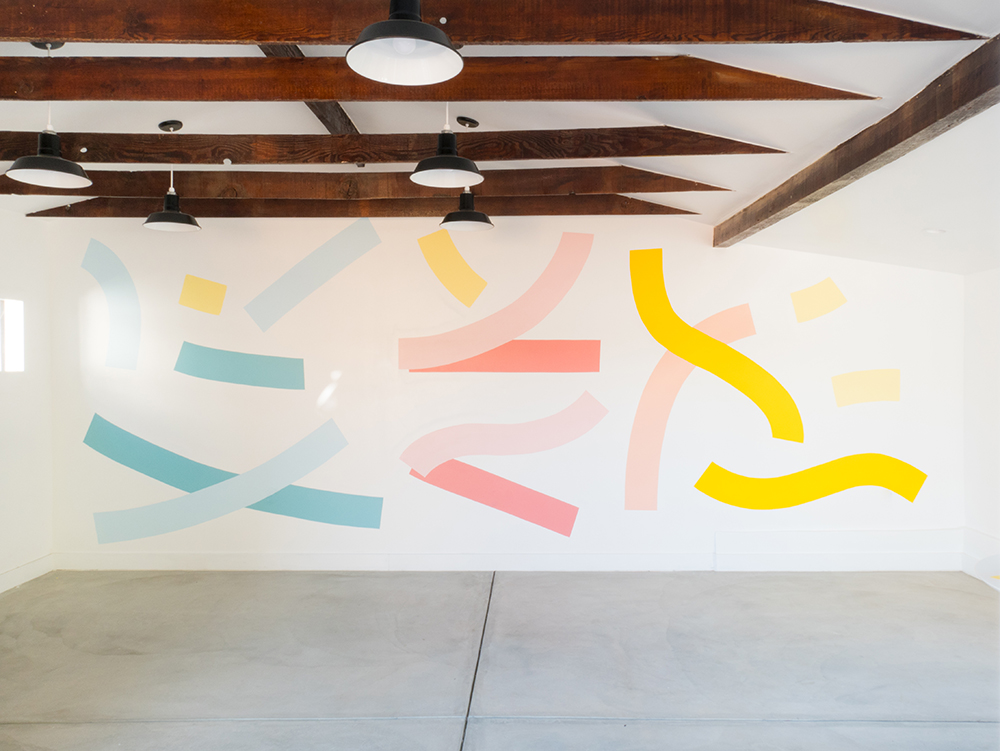
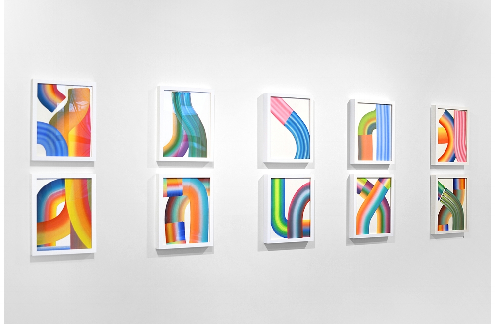
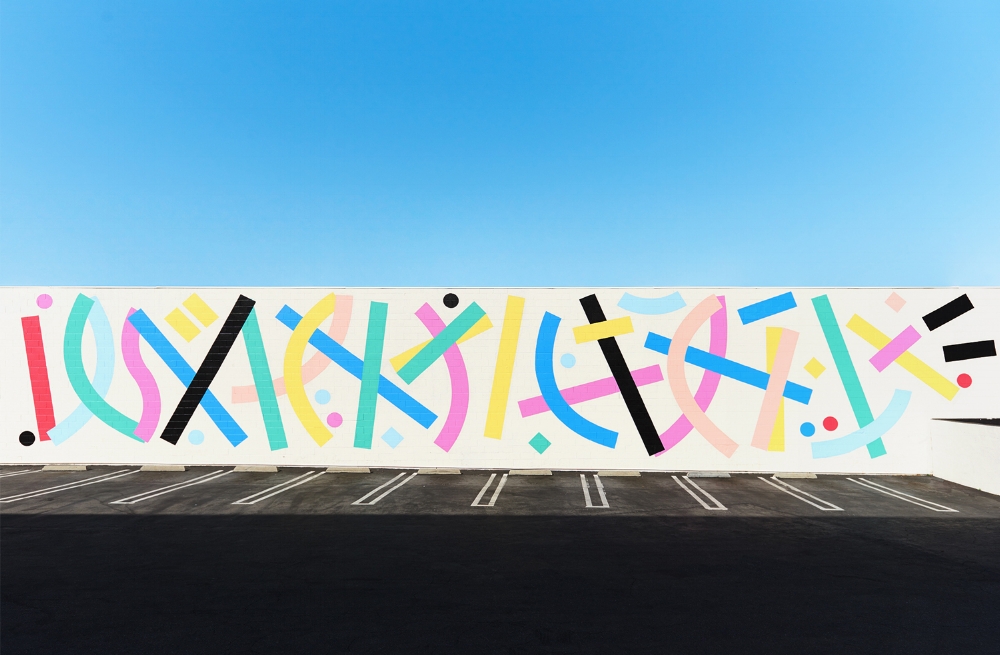
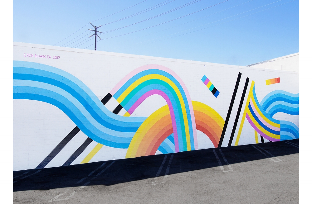
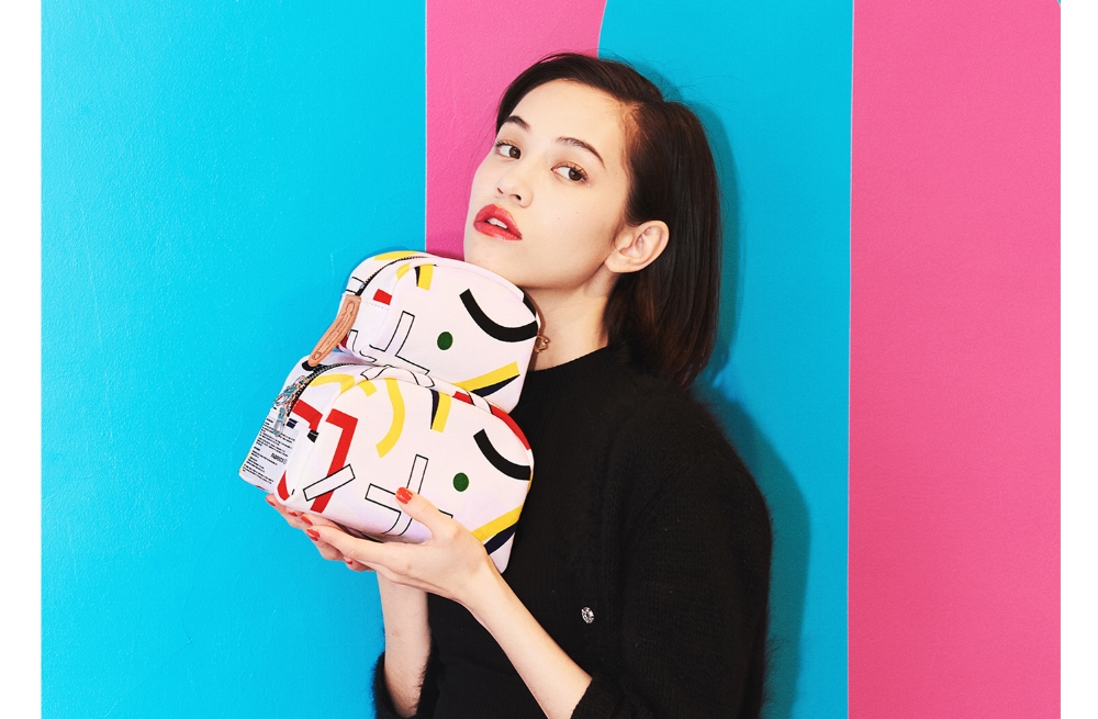
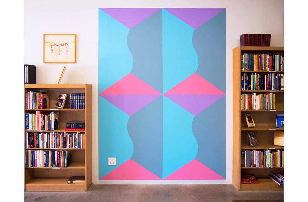
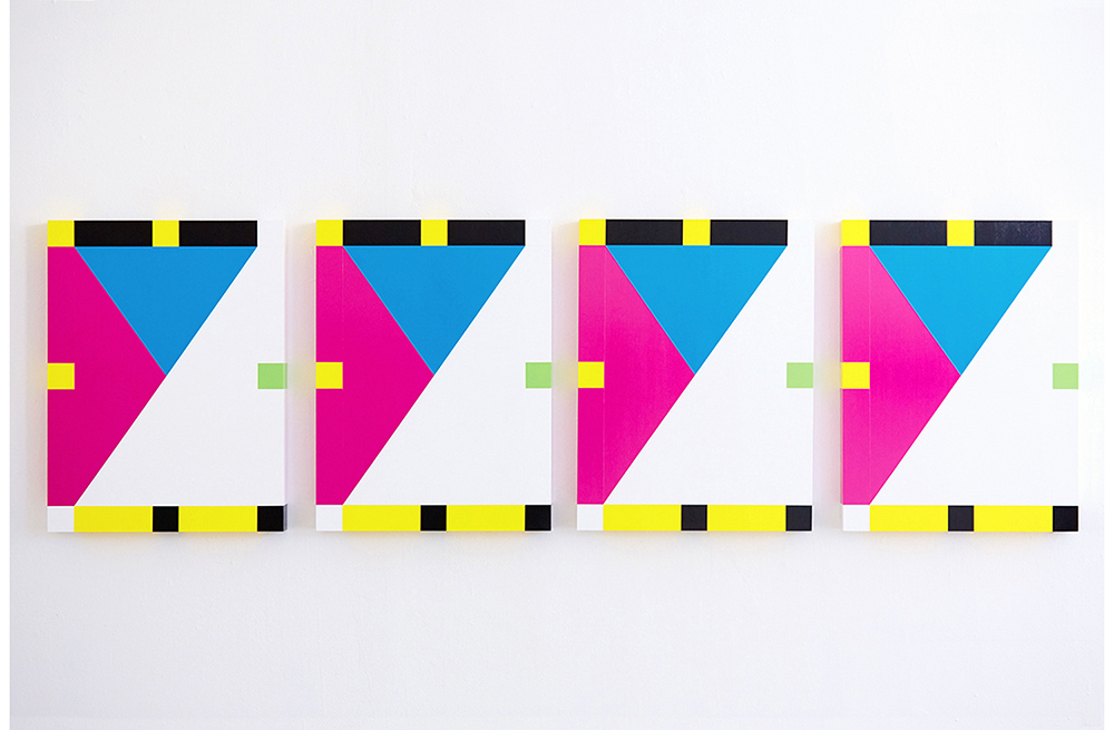
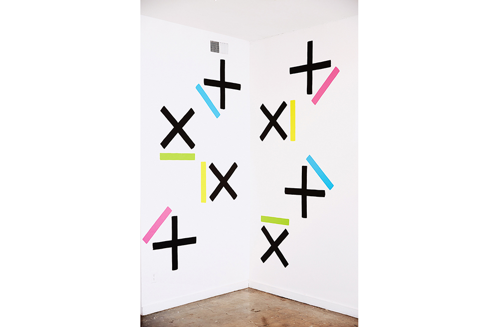
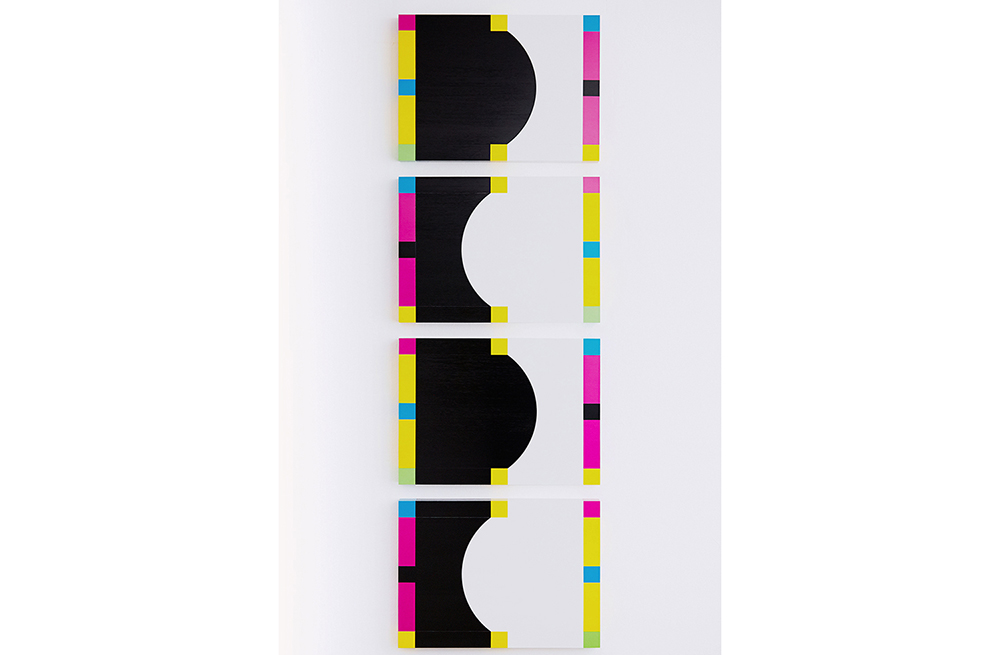
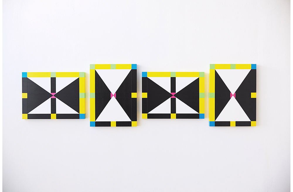
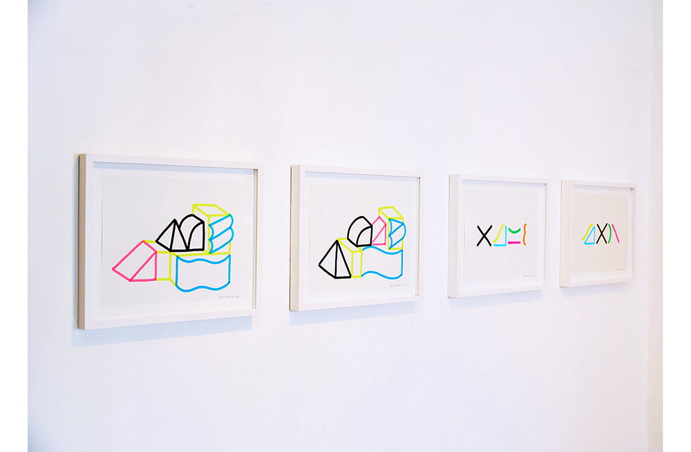
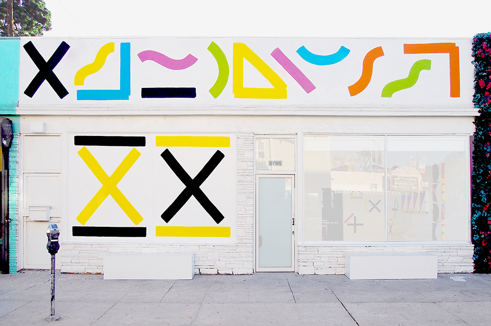
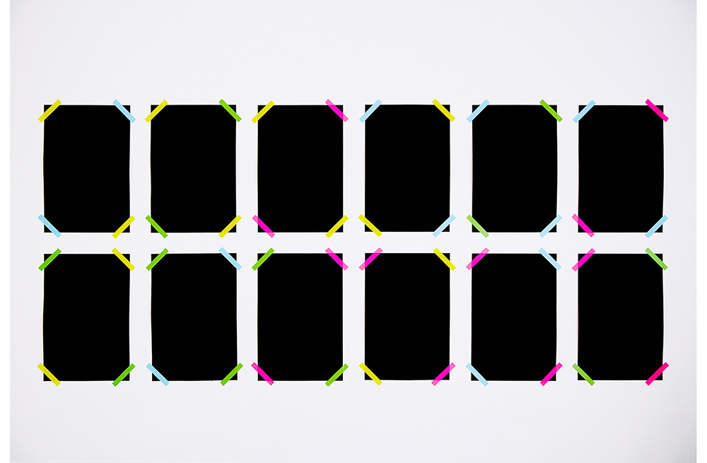
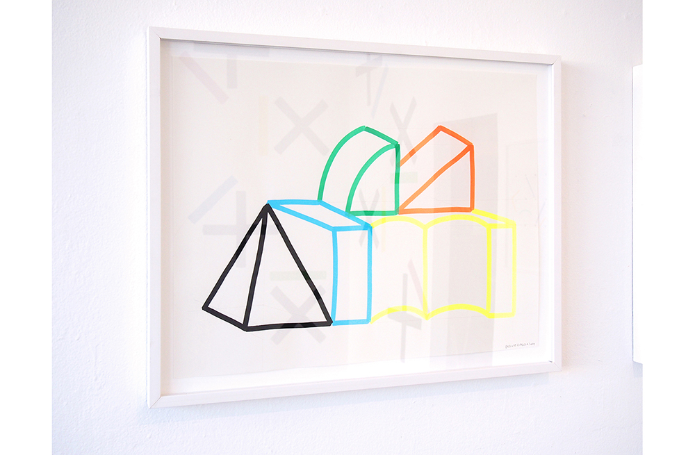
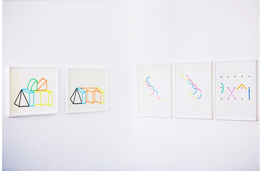
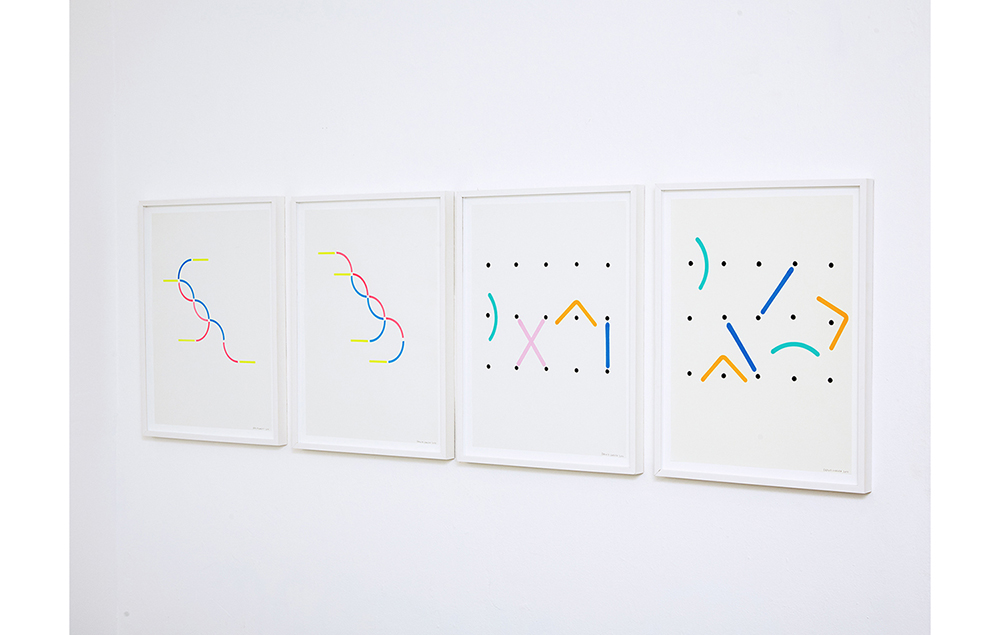
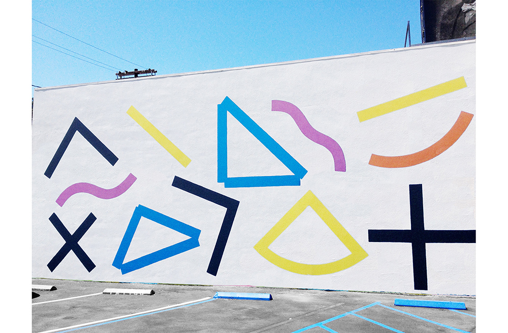
Erin’s geometric abstractions derive from a mother structure of Stacked blocks and volumes rendered in a series of colors. He deconstructs this architecture of color into a simpler lexicon of lines, arches, and curves in an ongoing search of other primary structures, or as he says, “elements”. These have been the units of full scale pop environments featured in fashion spreads for Bullett and Foam magazines and adorned the walls of the Ace and Standard Hotels. Though effortless in appearance, the ornamental function should not diminish the severity of his methodology. His work is a calculated process of designating, defining, arranging, and permuting elements and colors with algorithmic thoroughness. It embodies 1960′s Minimalism’s obsession with reduction, seriality, repetition, and a priori with a Sottsassian embrace of the decorative. However, with Erin’s treatment these shapes have never been so imposing and naturally enjoyable as the all-consuming and infinitely configurable Amen Break drum loop.
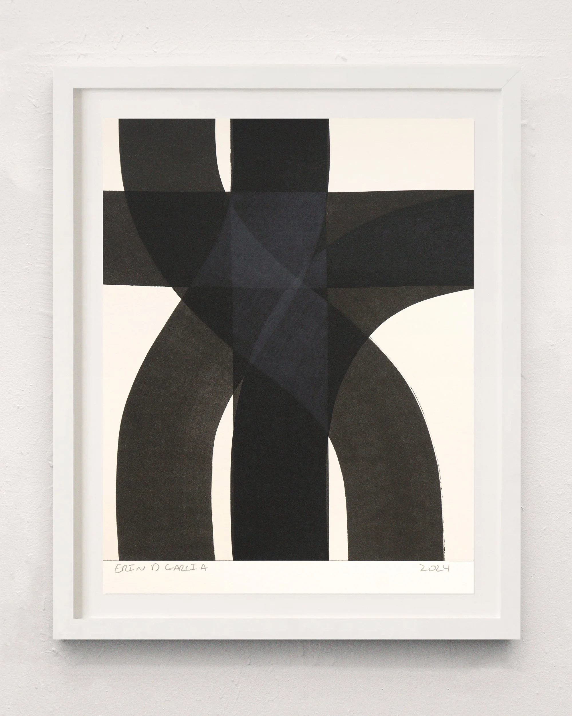
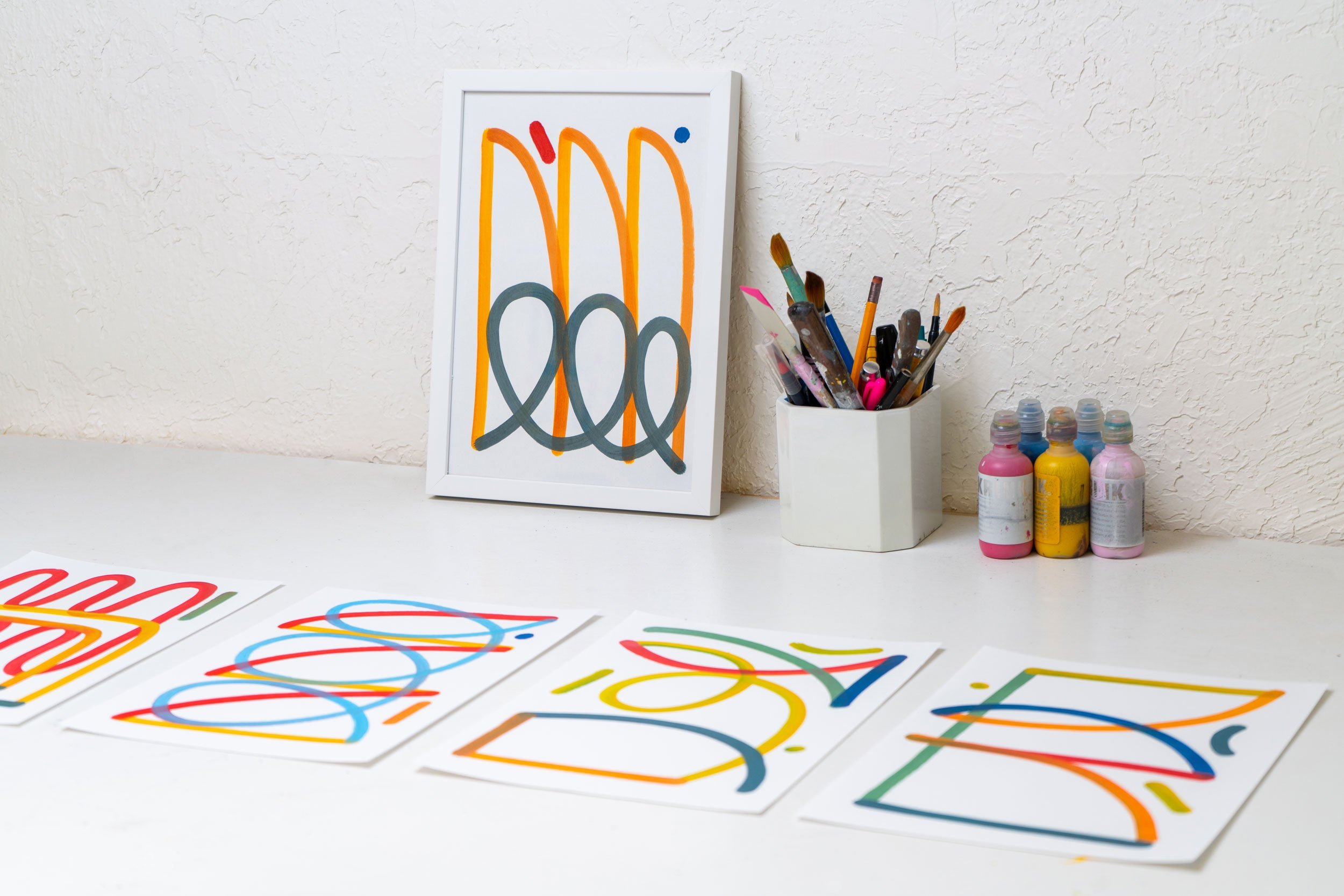
Erin’s work is in the title. Often reduced to a series of numbers, or definitions of a permutative process, there is an impulse to decode what number corresponds to what element, which is the color, and what is the relationship. All of this implies an inherent rhythm in the way that these patterns are arranged. His compositional logic is intimately tied to strategies of musical arrangement but exploit the mind’s tendency to complete data. Lines that edge triangles appear completed, but upon closer look, are actually disconnected and superimposed with unmet corners. Three dimensional solids we perceive as pyramids are actually incomplete and interrupted by yet another incomplete solid. It is a counterargument to the Gestalt, the theory of mind that the global whole is more than the sum of its parts. As if he means to argue that the global whole is actually a sum of parts. Or stated in Erin’s nomenclature, that “stacks” are just “elements” with no corners.
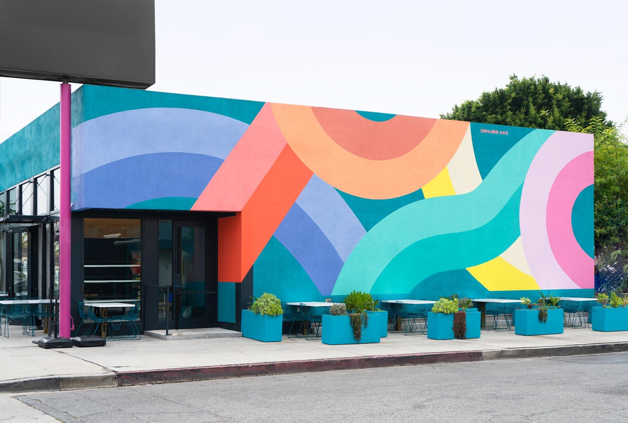
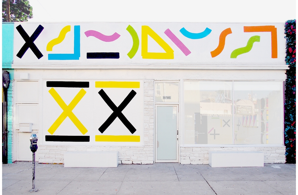
Minimalism’s gamble fell short with its habit of weighing down its simplicity with lofty theory. After all, less can’t be more when you have to read before understanding. Whether operating in the tradition of Gestalt or not, Erin’s work is instant. Ed Ruscha taught art to choose yellow, pink, and blue over black, white, and grey. The vibrancy of color, sterility, spontaneity, and casualness of appearance has come to be inextricably linked to the overall aesthetic of Los Angeles. Its strong history of pop, abstraction, and west coast lax is communicated in a language of waves, gloss, and playful irreverence. Erin isn’t claiming this territory, but rather, seems to be isolating LA’s formal identity into a codex of yellow half circles and blue waves that subconsciously reads as something distinctly Angelian.
It’s difficult in it’s procedural complexity, yet, refuses any need of calculation. It’s immediate, familiar. Something as fundamental as a shape is universal enough to draw cultural associations: sun, ocean, cross; yet, the moment you do, you’ve already overthought it.
To Sottsass colors are words; to Erin, colors are numbers, and numbers are beats.